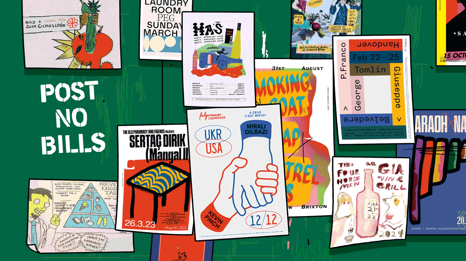
The swift convergence of food and music culture meets on the restaurant pop-up promo poster.
Back in 2013, an artist friend made a show poster for my old band Krill that depicted me and my two bandmates as poached eggs, floating in a pot of chunky tomato sauce. It was passed around on Facebook and printed to sell at the show alongside T-shirts and vinyl LPs. Looking at it today, the yellow background and playful illustration—one yolk is singing, another has a beard—catch the eye, while text communicates the necessary info. Bright yet decipherable with a bit of levity, it’s a typical indie show poster. But if I saw it on my feed now, I’d assume it was for a restaurant pop-up.
As someone with a background in both music and food, I’ve noticed the aesthetic language around concerts and pop-ups edging closer and closer together as social media has crystallized into an all-important promotional tool for both communities. While live music has a storied history of poster art that can trace its roots to the psychedelic ’60s (in particular shows promoted by Bill Graham at San Francisco’s venerable venue the Fillmore), the food world hasn’t always had the same relationship to the art form.
DIY shows don’t often feel like guest-chef dinners, but as the inverse becomes increasingly true, like-minded chefs and designers are taking inspiration from alternative music, fine art, and one another to create a new visual vocabulary for a rapidly changing food culture.
“You have this thing now that didn’t really exist a long time ago, where chefs aren’t in their restaurant—they’re on the road,” says Nils Bernstein, food editor at Wine Enthusiast and an alum of legendary indie record labels Sub Pop and Matador. “They’re essentially ‘playing’ small venues for one night, and then going to another venue for one night—they’re on tour!”
Indeed, this very language shows up on food world posters now too—from a sneakily corporate Momofuku Noodle Bar “on tour” poster (presented by Amex Gold Card) to the more indie Ha’s Đặc Biệt summer 2024 North American Tour, featuring clever art by the New-York-based pop-up’s friend, the artist and musician Ano Chrispin. “My first instinct is to emulate tour flyers,” Chrispin tells me. While he is a classically trained painter, he’s a self-taught graphic designer. “I look at various color palettes from album covers and slips and vinyl sleeves that I love,” he adds.
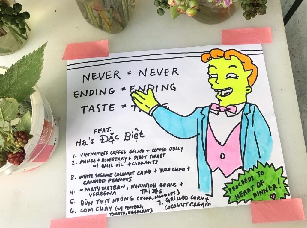
Natasha Pickowicz x Ha’s Đặc Biệt
Chrispin is not the only designer to code-switch between the worlds of music and food. “Record sleeves were one of the things that got me into [graphic design] in the first place,” says Rusty O’Shacklewell, the pseudonymous London-based graphic designer who makes posters for restaurants like BRAT and Kiln through his studio Personality Crisis. Long before he ever made a pop-up poster, he was doing graphics for shows around London in the early 2000s. “I cut my teeth in that world,” he tells me. “I did stuff for mates who were DJs or in bands.”
At the time, he was working at a music promotions company alongside Ben Chapman, who went on to found London’s Super 8 restaurant group in 2014. Naturally, O’Shacklewell was tapped to create posters when Chapman’s restaurants started putting on events, and the directive was simple: “I remember him saying to me: ‘I’m just gonna promote the chef like it’s a gig’—and that’s kind of what we did!”
Around the same time, designer Tegan Ella Hendel moved to London from her native Australia and began making posters for the beloved wine shop and bar P. Franco—a pioneer for its embrace of guest chef culture and its ambitious food conjured from two induction burners. “It was like, ‘We wanna throw a party, how do we get people to come?’” she remembers. Hendel didn’t have a background in music specifically, but she had worked as a graphic designer at the Australian youth subculture magazine Monster Children, which covers surf, skate, film, and music. Creating event posters for a restaurant may have been somewhat novel, but it felt like second nature. “If you’ve been working in an industry where that kind of crossover is really normal, you don’t think twice,” she says.
Where O’Shacklewell’s work is more textured, with layers of scanned, collaged, and otherwise manipulated forms, Hendel’s is minimalist and type-focused, yet similarly colorful. Her designs became nothing short of iconic in London; they were printed and displayed at the bar to promote upcoming events and later framed and hung salon-style, covering one of P. Franco’s walls. Before long, fans of the restaurant were asking to buy them, so Hendel began offering an annual sale of her favorites.
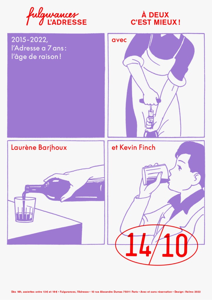
Helmo x Fulgurances
Thomas Couderc, half of the Paris-based design studio Helmo, which makes posters and graphics for the Fulgurances family of guest-chef-oriented fine-dining restaurants, first had to advocate for the restaurant group to print the posters he was designing for special dinners. But before long, Fulgurances saw the value, and the posters were hung around town at friends’ restaurants. “The visiting chefs were especially happy to have a physical poster to bring back with them,” he says. “It was so uncommon to have an actual poster for one of their dinners.”
Couderc and his partner, Clément Vauchez, worked for years doing graphics in the contemporary jazz world before linking up with Fulgurances. And when the duo started working on the pop-up incubator’s event flyers, “they showed us posters from an English restaurant,” he tells me, referring to P. Franco. Helmo put their own stamp on the genre with a style based around risograph printing, which has a limited color palette and natural analog warmth. If screen printing is vinyl, riso is cassette.
But despite the print pedigree of the form, social media undoubtedly helped to facilitate the design conversation between these and other restaurants united around a reverence for—and many of the folks I spoke to were quick to asterisk this term—natural wine.
“There’s something with natural wine where it really feels like it’s in opposition to something,” says Bernstein, who was Nirvana’s original publicist before pivoting to a career in food and wine. “It really is a reaction against something that’s artificially polished for a mainstream audience,” he adds. “In that respect, it has more in common with indie music or punk rock than maybe the food equivalent, and it makes sense that they would visually position it in that way.”
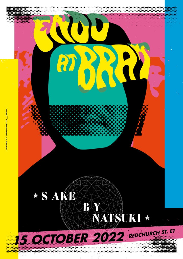
Personality Crisis x Brat
This idea shines through in the art associated with influential Brooklyn restaurant and wine bar the Four Horsemen—a place alive with the widely known music DNA of partners James Murphy of LCD Soundsystem and wine director Justin Chearno, whose trademark noisy guitars enriched the sound of several notable ’90s and early-aughts indie bands. It’s no surprise that their go-to illustrator, Mike Paré, came up in the same Williamsburg scene, playing guitar in the band Roxy Pain and working on posters for Todd P shows at the storied screenprinting studio Kayrock.
His hand-drawn, ink-on-paper style, which graces pop-up flyers shared virtually as well as an annual printed poster, is widely cited as instrumental in defining this movement. “Instead of spelling it out and making it graphically perfect, it’s a rejection of that—it’s telling the viewer that it’s a casual place, it’s a sincere place, and it’s a place where you can just be yourself,” he says of his work.
What is the precedent for the pop-up flyers of today? Once again, my mind goes first to the Bay Area—but in this case to Berkeley. Chez Panisse’s seminal embrace of a distinct visual identity blossomed just after the Fillmore’s late-’60s psychedelic poster explosion. And just like famed Fillmore poster designer Wes Wilson, artist David Lance Goines channeled Toulouse-Lautrec and art nouveau in his annual birthday posters and menus for Chez Panisse.
“I think there is a background for how food and art have spoken to each other for such a long time,” says Hendel, who is now back in Australia, having helped open the new Melbourne wine bar Brico. The artist-run Soho restaurant FOOD (which was holding guest chef dinners in the early 1970s) is one example she cites; LA’s the Egg and the Eye is another—the ’60s and ’70s-era gallery and underground event space featured a restaurant serving more than 50 types of omelettes (and nothing else). Sure enough, I found early event posters from each place, both with the kind of winking irreverence I recognize in the posters proliferating today.
“That humor is actually a big part of this aesthetic,” says Paige Lipari of Brooklyn’s Archestratus Books + Foods, a cookbook store and community hub known for its events. “There’s a hospitable energy to an indie show poster that’s the same hospitable energy at a pop-up—it’s a little askew, and if it’s trying to be serious, there’s usually an ironic edge to it.” The Simpsons-character-rich, hand-drawn flyers by Lipari’s friend Natasha Pickowicz, the pastry chef and cookbook author, are a perfect example.
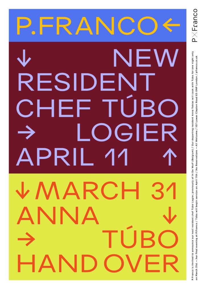
Tegan Ella Hendel x P. Franco
Pickowicz, who has a background in DIY and used to book experimental and noise shows, started hand-drawing flyers to promote pop-ups at the original Superiority Burger location in 2020. “It felt like a very natural way of paying homage to my roots while also defining a pop-up aesthetic that felt in opposition to the fancy fine-dining world I was coming from,” she says. Her choice to draw with black Sharpie was itself a reference to how Superiority Burger displayed specials—of course an extension of that same punk ethos.
“Those ideas exist more in the indie food world than they do in the indie music world these days,” says Bernstein, and besides, “the visuals around it are now their own thing that people pull from,” he adds. “You and I reference it as indie music or something, but other people just see it as ‘cool food culture.’”
He’s right—and while gig posters have played a part in defining a framework for pop-up visuals, these artists and more are helping push the form forward as the landscape evolves. “It’s such a super new scene, it’s cool to watch it build its own visual identity,” says Chrispin, of Ha’s Đặc Biệt, which recently announced a brick-and-mortar location on the Lower East Side. “I don’t know where this shit’s gonna go,” he adds, “but it’s super interesting. And it’s fun to be a part of it, too.”