Meet Gander, the New York-based studio that helps food brands takeover Instagram.
The dairy aisle is not, historically, an avenue for glamour. Our standard supermarkets tend to lack the see-and-be-seen quality of buzzy wine bars or sought-after sample sales—and our basic groceries are selected with far less stringent curation than, say, our outfits. Whole milk is whole milk is whole milk, just as olive oil is olive is olive oil . . . unless your cooking oil comes housed in, say, a kelp-green squeeze bottle with a kitschy line-drawn logo.
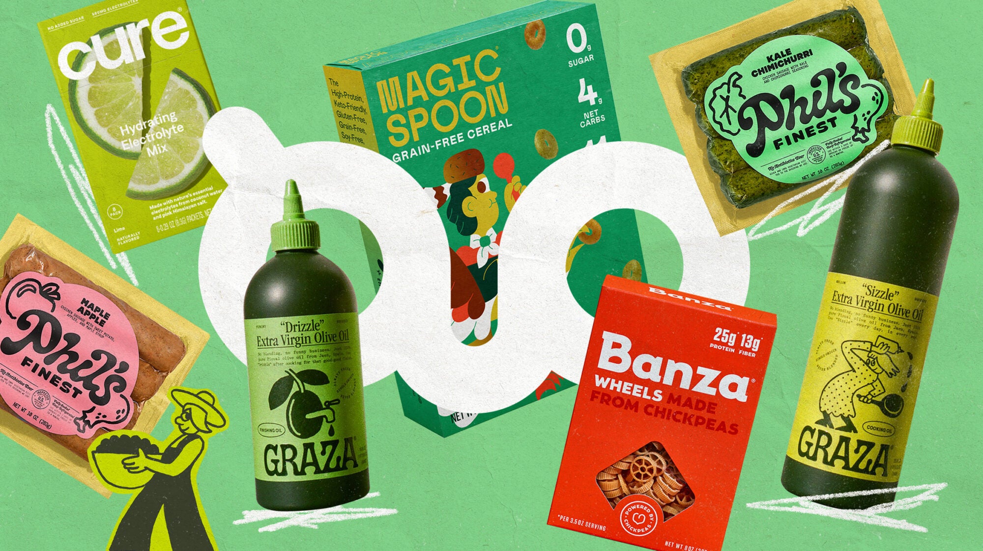
Right now, it would seem that grocery shopping grows more fashionable by the day. In the era of the “shelfie,” our contemporary, capital-B branded food products present as accessories just as much as they do utilitarian goods. Think cute-as-hell anchovy tins, grain-free cereals, canned nonalcoholic spritzes, chickpea noodles—the likes of which live not just in our targeted Instagram ads and our high-end shoppy shops but on the good ol’ fashioned shelves of places like Key Food and Publix.
“If you go to the grocery store and you buy a box of pasta or a can of tomatoes, you don’t really care how it looks. It’s functional. But when we give grocery items the same creative treatment we apply to DTC beauty products or fashion labels, grocery shopping becomes a wholly more creative experience,” says Katie Levy, partner at Gander—a full-service branding agency responsible for the visual identities behind countless trendy grocery products like Graza olive oil, Banza pasta, and Gotham Greens. “People don’t really tend to know what ‘extra-virgin’ means—but they do want to derive pleasure from the project of shopping for oil.” And the same is true of everything from milk alternatives and canned seltzers to yogurt cups and jarred pickles.
We sat down with Levy to break down the ins and outs of creating a visual identity for a food product—and what that means for our consumption habits.
What distinguishes food branding from more general product branding?
To be honest, they’re one and the same—but for a long time, creative agencies were sleeping on grocery products. It felt like trending advertisers or designers didn’t care as much about the visual identities of food items as they did other product categories like fashion or beauty.
That’s why my team is approaching food and beverage with the same brand identity principles that are usually reserved for other categories. We’re thinking about social media campaigns, fonts, color palettes. About the way products photograph or how they look on a countertop. We’re treating granola bar launches like a fragrance or clothing drop.
What does it take to compose a brand identity?
Traditionally, a brand identity involves a logo mark of some kind, a family of typography, a color palette, and a photography direction. Oftentimes, it also means developing a brand tone of voice for headlines and taglines, and a website as well as packaging. But, broadly speaking, brand identity isn’t about specific deliverables. It’s about a concept: finding what’s really interesting about the brand in question and displaying that through copy and design.
Anytime we begin working with a new client, we go through a lengthy discovery phase where we try to learn as much as humanly possible about them. And, in part, that really depends on where they are in their life cycle. Maybe we’re helping a brand with their initial launch. Maybe they were the first to market with some sort of product ten years ago, and now there are a million brands that are selling the very same thing, so how can they distinguish themselves?
All the same, we learn everything we can about what’s happening around a particular type of product in this moment. What does the current landscape look like? Who is a client’s current audience, and how are they hoping for that to change? We’ll survey hundreds of people to learn how they’re shopping and what their favorite brands are. It’s only when we have all the information we could possibly need that we start building out a creative platform.
What does that look like in practice?
When we began working with Graza, they had this amazing product, and they knew they wanted it to come in a squeeze bottle, but they didn’t know much else. So we did a bunch of really interesting consumer outreach for olive oil. Most people didn’t really know what “extra-virgin” meant, but they said it was extremely important to them. And most also didn’t have a favorite olive oil—they’d reassess every time they went to the store based on the cooking project at hand or the price point. Maybe something that’s not the worst, and not the best either.
Of course, plenty of beautiful brands of artisanal olive oil have been around for a very long time. But not many were attempting to serve the everyday market. We wanted to make Graza into a product that made people very interested in the type of oil that they were buying. And, as it turns out, people were just hungry to have a brand that they could feel excited about that they could also grab at the local Key Food.
We worked with Graza to create every element of the brand, from the photography and the label illustration to the web design: We wanted bright colors to differentiate the plastic squeeze bottle, and basic packaging that listed the important facts (single-origin, extra-virgin, organic) without overwhelming consumers with tons of information they neither want nor need. And we also wanted to demystify the difference between cooking oil and “finishing oil,” which is where the “drizzle” and “sizzle” monikers on the bottle comes from.
Now, as we continue to work with Graza, we’ve just been blown away by their success. We’re seeing the stuff on shelves everywhere in the country—not just New York and California. People have gotten the artwork tattooed on their bodies. They’re such strong proof of the reach of a great product, with great branding, that solves a very real need or gap in the market.
Do you have to taste a product in order to give it a visual identity?
Yes, absolutely. We simply don’t work with brands whose products we wouldn’t eat ourselves. We’ve definitely had people reach out in the past to work with us, and once they sent us the product samples, we declined to work with them—and we take a lot of pride in that. We ultimately wind up being huge advocates for every brand we work with. We’re often stocking our office with their products, and our employees are eating them. We’re gifting them to people who come in the door. So we need to be really proud of whatever it is that we’re creating brands for.
Are there any specific design or copy elements that reliably draw folks toward a food product?
I would say the secret is in making a product approachable. You want to humanize the shopping experience. Think about your typical old-school box of pasta: It probably has an image of some perfectly ornate, beautifully twirled forkful of pasta with a single piece of parsley on it. But these days, that’s not how we’re styling food. That’s not what people want. Brands like Bon Appétit have really shifted the way food is being styled: Things are messy and casual. There are hands involved, crowded tables, countertops covered in flour. It’s casual, and it’s human, and that makes the food and beverage world feel so much more accessible.
Of course, I can’t really say that there’s one objective and obvious thing that will draw any audience in, but if I were to pick one thing I think most people are drawn to, it’s the act of breaking down that wall between the consumer and the advertising world. At the end of the day, people just want to feel spoken to like . . . real people.
How does a food product’s branding impact our consumption experience?
Most of us don’t think of our most basic grocery shopping as fun. Sure, the farmers’ market is lovely, or the wine store, but when we’re getting pantry staples, it’s an errand. You’re saying, “Hey, I need canned tomatoes for pasta sauce.” That said, when you’re in the tomato aisle and you look at something and you’re like, “Whoa, I actually want to buy this for reasons beyond the fact that it will be exactly what I’m expecting it to be: tomatoes in a can,” that’s exciting. You’re finding delight in this little, prosaic thing.
For me, personally, I’m thinking of Bianco DiNapoli tomatoes. For as long as I can remember, I’ve bought whatever San Marzano brand was around, but I love that Bianco DiNapoli packaging. Now, when I go to the store, seeing those labels makes buying peeled tomatoes feel like a fun luxury. I like seeing the cans in my pantry. I’m excited to use them. I love cooking, so anytime I feel like I’m interacting with a brand in a way that makes my cooking experience more fun, or I’m joyful, I want to continue to seek out that product.